Bunks 3, 4 and 5 painted the backgrounds for this project with warm or cool colors, then used tissue paper and multiple layers of circles for the flowery foreground.
Friday, October 28, 2016
Gustav Klimt Trees
Theres nothing better than a Gustav Klimt swirly tree to me. This project took 2 class periods because the background had to dry first. We used cut up tissue paper squares with watered down glue paint for the background. Then we used black acrylic to paint the beautiful trees on top. These were done by 6 year olds and look way more advanced to me.
Swingin' silhouettes
I love the simplicity and color scheme of this beautiful project. Campers made silhouetted self portraits with oil pastels and watercolors (can you tell I love these materials together?). First they drew a tree, swing and their silhouette with black oil pastels, they they used white for the moon, stars, clouds, etc. They used purple and blue liquid watercolor and top and voila... a dreamlike painting in 45 minutes!
Frank Stella inspired watercolors
This was my second Frank Stella themed project, but instead of using his extreme precision, we let loose a little with watercolors and overlapping. Campers created their compositions with circle shapes throughout the room and painted with watercolor.
Oriental teapots
Honoring teatime with Ms. Honey and Matilda, we made oriental tea pots with paper plates and acrylic paint.
Gruesome Newts
I really wish I got more pictures of these awesome Mexican inspired geckos (newts) by 10-12 year olds. I love the color and style.
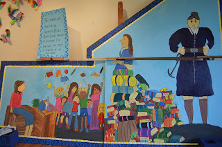
Matilda Mural
Our mural was obviously inspired by Matilda, as was every other project at camp this summer. We learned about and collected a lot of beautiful Quentin Blake illustrations. Quentin Blake was Roald Dahl's go to illustrator and has a beautiful sketch like illustrative style. We put together our mural based on his sketches. It is now hanging in the hallway at Allens Lane Art Center.
Leaf Fashion
Bunks 4 and 5 went outside to collect beautiful bits of nature and then glue them together with simple drawings to create leafy fashion sketches.
Cute Kandinskys
Bunk 1 made Kandinsky painting that looked pretty similar to the original. They just used bright colors and repeated circles. It was easy, fun and turned out beautiful.
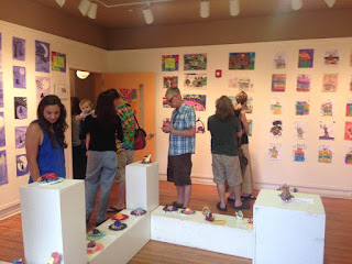
Revolting Gallery #1
Halfway through camp, at the end of week 4, I put up all the work in the beautiful gallery that the campers had made. Although the theme was "revolting" it turned out to be very pretty :)
Subscribe to:
Comments (Atom)


